A design system so your product stops looking like five different apps.
Every new feature shouldn't mean redesigning buttons, forms, and tables from scratch. We build Figma design systems and matching component libraries — plus the admin panels and dashboards that use them — so your product stays visually consistent as your team ships faster.
When you need a system, not another one-off screen
Every new feature gets its own inconsistent button styles and spacing.
Your admin panel was built as an afterthought and it shows.
Designers and engineers argue over spacing and color because there's no single source of truth.
Onboarding a new designer or developer takes weeks because nothing is documented.
Everything under Product systems.
Figma Design Systems
Documented components, variants, and design tokens as the single source of truth.
Admin Panel & Dashboard UI
Internal tools that are actually pleasant for your team to use daily.
Component Libraries
Coded components matching Figma exactly — no design-to-dev drift.
Design Tokens & Theming
Color, spacing, and typography systems that support dark mode and rebrands.
Cross-Product Consistency
One visual language across your marketing site, app, and admin tools.
Launch Infrastructure
CI/CD, staging environments, and deploy pipelines set up correctly from day one.
How we build it.
Audit the UI debt
We catalogue every inconsistency across your current product.
Build the system
Figma components and coded equivalents built in lockstep.
Roll it out
Existing screens migrated, new ones built on the system from day one.
Recent product systems work
Real client projects, not stock case studies.

Civil Engineering & Architecture
Pashupati Techno Dreams, Silchar
A high-performance engineering & architecture consultancy web application for Pashupati Techno Dreams in Silchar, Assam. Featuring a custom full-width capabilities carousel with image rotation correction, double-email highlighting, Google Search Console indexing files (sitemap.xml and robots.txt), and direct WhatsApp appointment booking integrations.
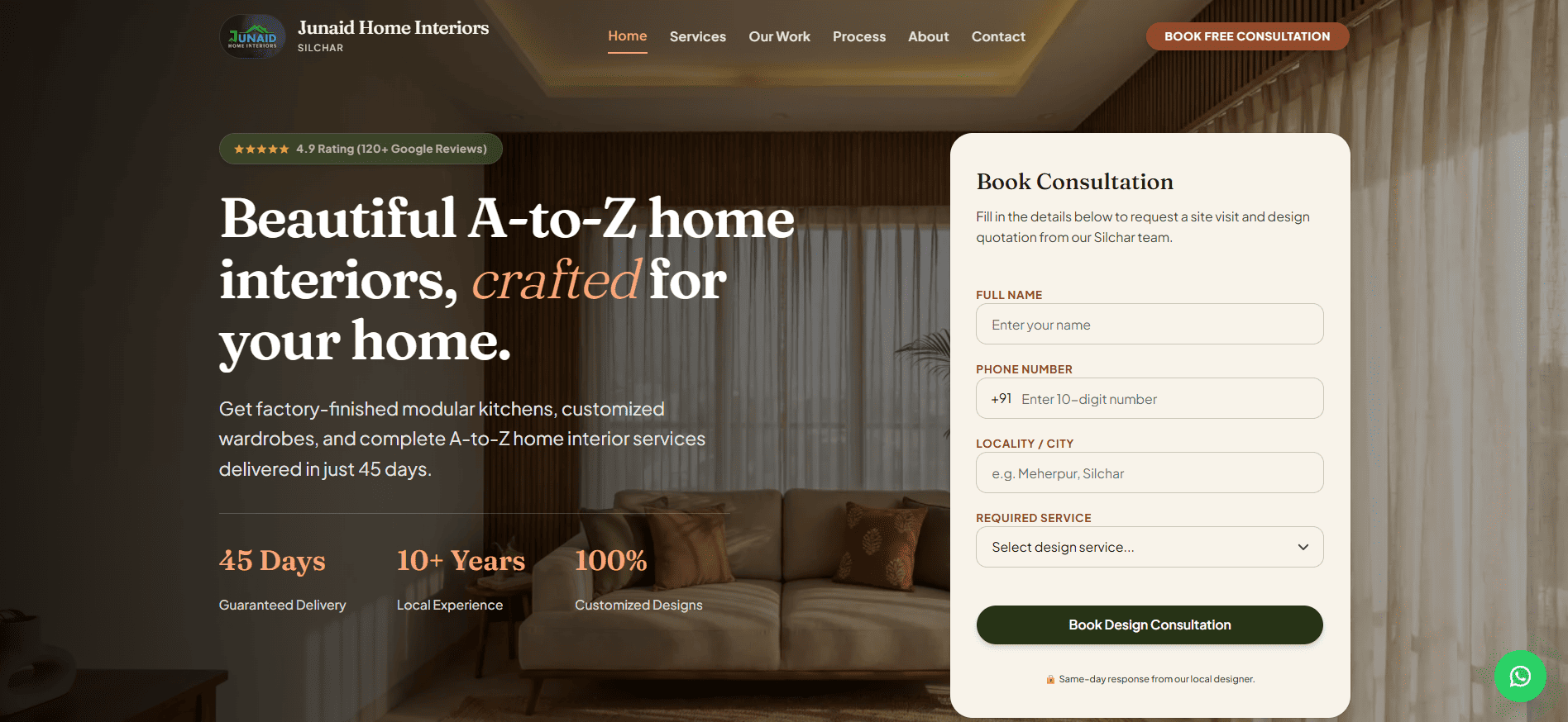
Interior Design & Architecture
Junaid Home Interiors, Silchar
A luxury, ultra-fast turnkey interior design web application and Headless Sanity CMS integration for Silchar's premier home interior firm. Achieved 99/100 Desktop PageSpeed, 100/100 across Accessibility, Best Practices, and SEO, 34 301 legacy GSC redirects, Lenis kinetic scrolling, and instant WhatsApp consultation lead capture.
Frequently Asked Questions
Q.What's included in a design system?
A documented Figma library of components, variants, and design tokens (color, spacing, typography), plus a matching coded component library so engineering and design stay in sync as the product grows.
Q.Do we get the Figma files?
Yes — the full Figma design system and component library are yours, along with the coded implementation. No proprietary tooling required to keep using it after we're done.
Q.Can this integrate with our existing codebase?
In most cases, yes. We assess your current stack first and build the component library to slot into your existing React/Next.js codebase rather than requiring a rewrite.
Q.Is this worth it for a small team?
If you're shipping new screens every week and inconsistency is already visible to users, a lightweight design system pays for itself quickly in faster builds and fewer design/dev back-and-forths — it doesn't need to be a huge upfront project.
Other capabilities
Ready to start your
product systems project?
Tell us what you're building. We'll reply with next steps within 24 hours.